Cheddar’s Travels is a two-tier packaging design project created for a line of cheddar cheese snacks. Each tier explores a different design approach—one rooted in storytelling and heritage, the other in bold, modern shelf presence.
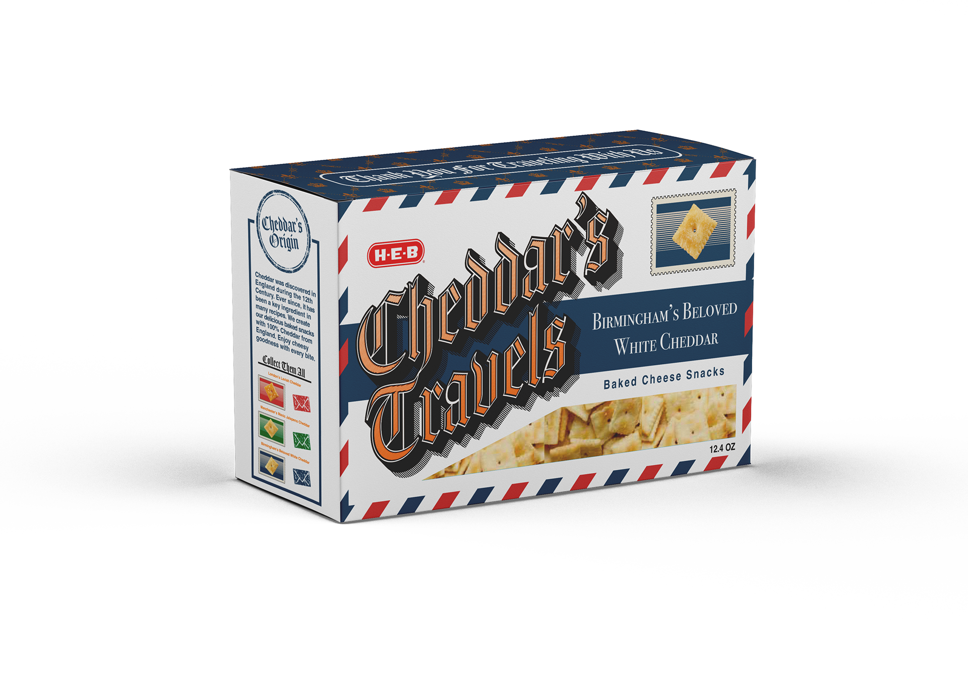
Tier 1 – Branded Heritage Concept
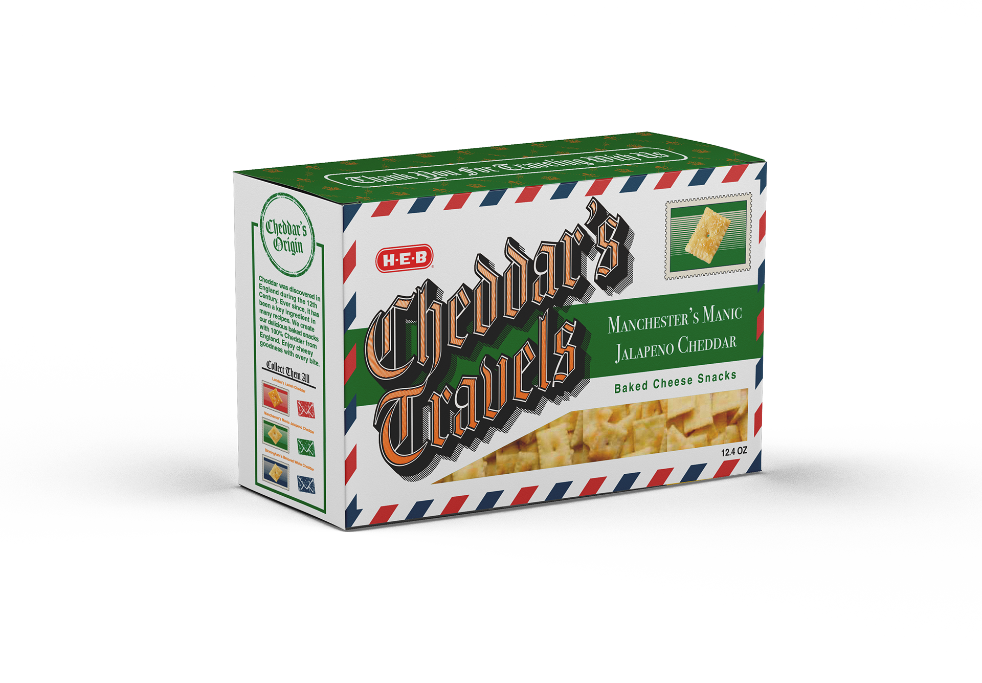
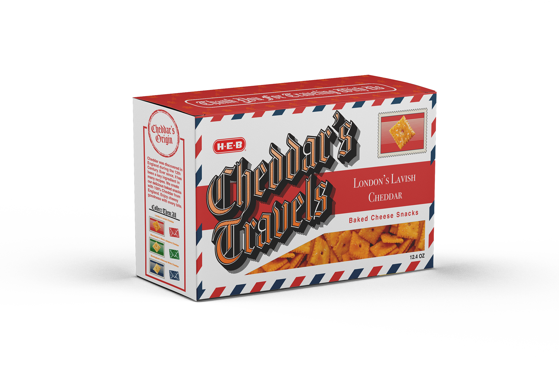
Inspired by the origins of cheddar cheese in England, this design tells a story of authenticity and tradition. Incorporating visual references to English cities and using a vintage “mail” motif, the packaging serves as a passport for consumers—showing them exactly where their cheddar comes from. This tier emphasizes brand personality, history, and cultural connection through research-based design.
Inspired by the origins of cheddar cheese in England, this design tells a story of authenticity and tradition. Incorporating visual references to English cities and using a vintage “mail” motif, the packaging serves as a passport for consumers—showing them exactly where their cheddar comes from. This tier emphasizes brand personality, history, and cultural connection through research-based design.


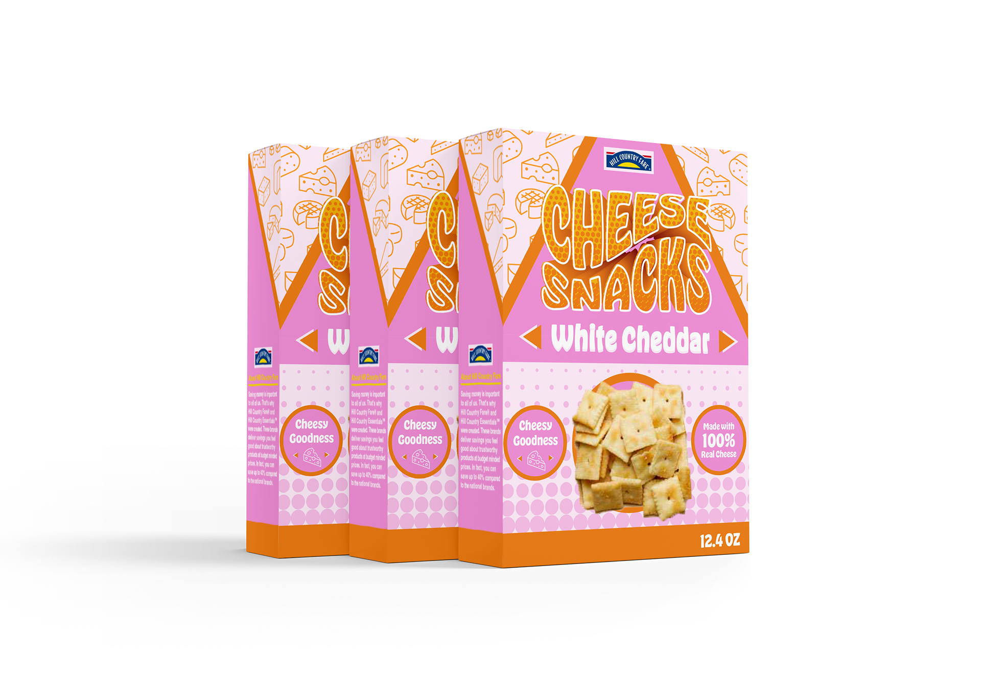
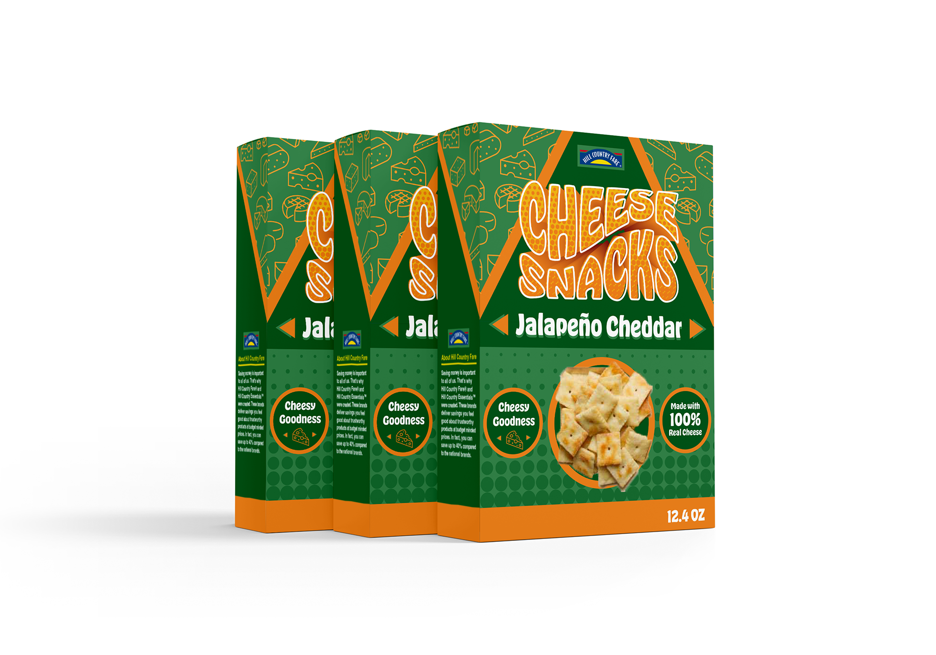
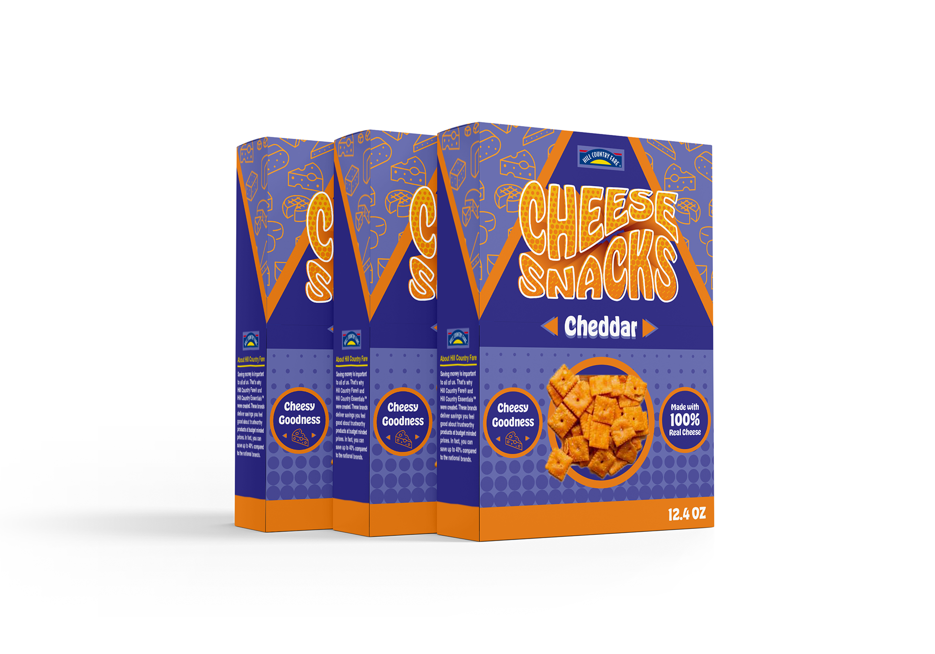
Tier 2 – Modern Generic Store Branding
In contrast, the second tier prioritizes shelf impact over storytelling. The design uses bright, colorful graphics and bold typography to instantly catch the shopper’s eye. Without a historical narrative, this tier focuses purely on contemporary appeal, playful visuals, and vibrant energy—perfect for attracting attention in busy retail environments.
In contrast, the second tier prioritizes shelf impact over storytelling. The design uses bright, colorful graphics and bold typography to instantly catch the shopper’s eye. Without a historical narrative, this tier focuses purely on contemporary appeal, playful visuals, and vibrant energy—perfect for attracting attention in busy retail environments.